Logo
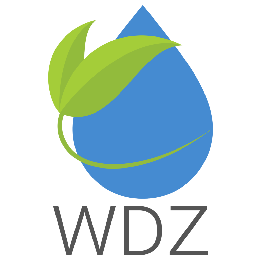
One’s branding, specifically the logo, is often the first impression people have of a brand or company. The logo is going to be used in multiple ways, so it is best to keep the design responsive as to give maximum impact in any use and against any background.
Water Damage Zone wanted a new logo that reflected their growth when contrasted with their old branding. Their prior logo was similar in design, but followed a three dimensional style. Their new corporate style stance as a business called for a new logo with a flat style that allowed for greater range in use while giving a professional impression.
Colors
The client’s prior color pallet consisted of much lighter tones which meant it didn’t really stand out against lighter backgrounds. This new color pallet was chosen intentionally so the colors would stand out against both dark and light background. The blue tone represents water and in color psychology terms, trust. The green color represents their forefront mission to use green cleaning products as much as they could with their services. Finally, the orange-red tone is meant to invoke a sense of urgency that comes with their emergency water damage services.
#92bb3c
#458bd1
#555555
#E65100
#f8f8f8
Typography
This typeface was chosen for its wide range of weight options and readability.
Roboto


