Logo
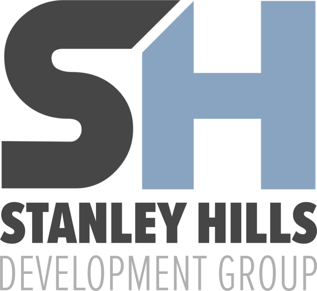
One’s branding, specifically the logo, is often the first impression people have of a brand or company. The logo is going to be used in multiple ways, so it is best to keep the design responsive as to give maximum impact in any use and against any background.
The Stanley Hills Development’s new branding needed to stand out from others in the high-end home build and remodeling industry. Brands named after a person or a place often use typography to form their branding, and that’s what the client asked for, but the challenge was going to be how to make it creative and stand out. Home design often uses a lot of square corners and bold elements. The logo was custom designed to have a bold shape while using a 45 degree line effect to give a bit of a creative flair to the bold typography that has a lot of right angles.
Colors
This client reinforced that they work with a lot of investors and wanted their new brand identity to help in their effort to grow their reputation. This can be aided by the use of color psychology, which brought me to the color of blue…the color of trust.
#89a4c1
#bcd0e7
#f8f8f8
#b0b0b0
#252525
Typography
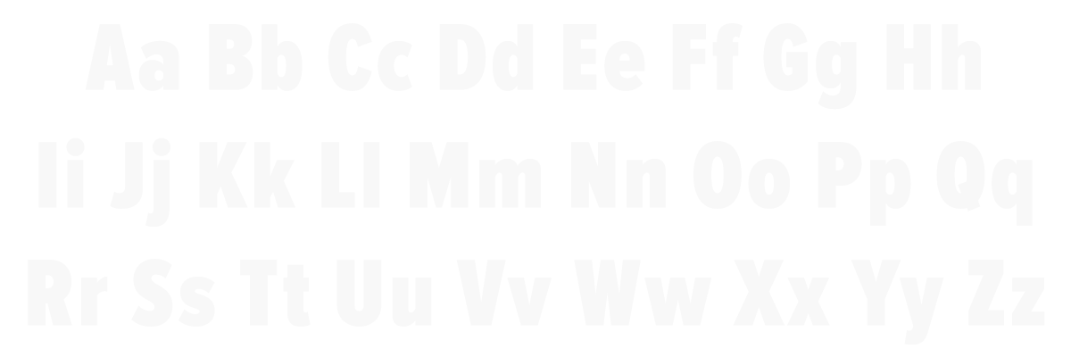
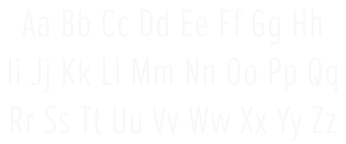
The following typefaces were chosen for their ability to be read at a glance while still having a slight flair that deviated from the standard.
Proxima Nova Extra Condensed Black
Proxima Nova Extra Condensed Light


