Logo
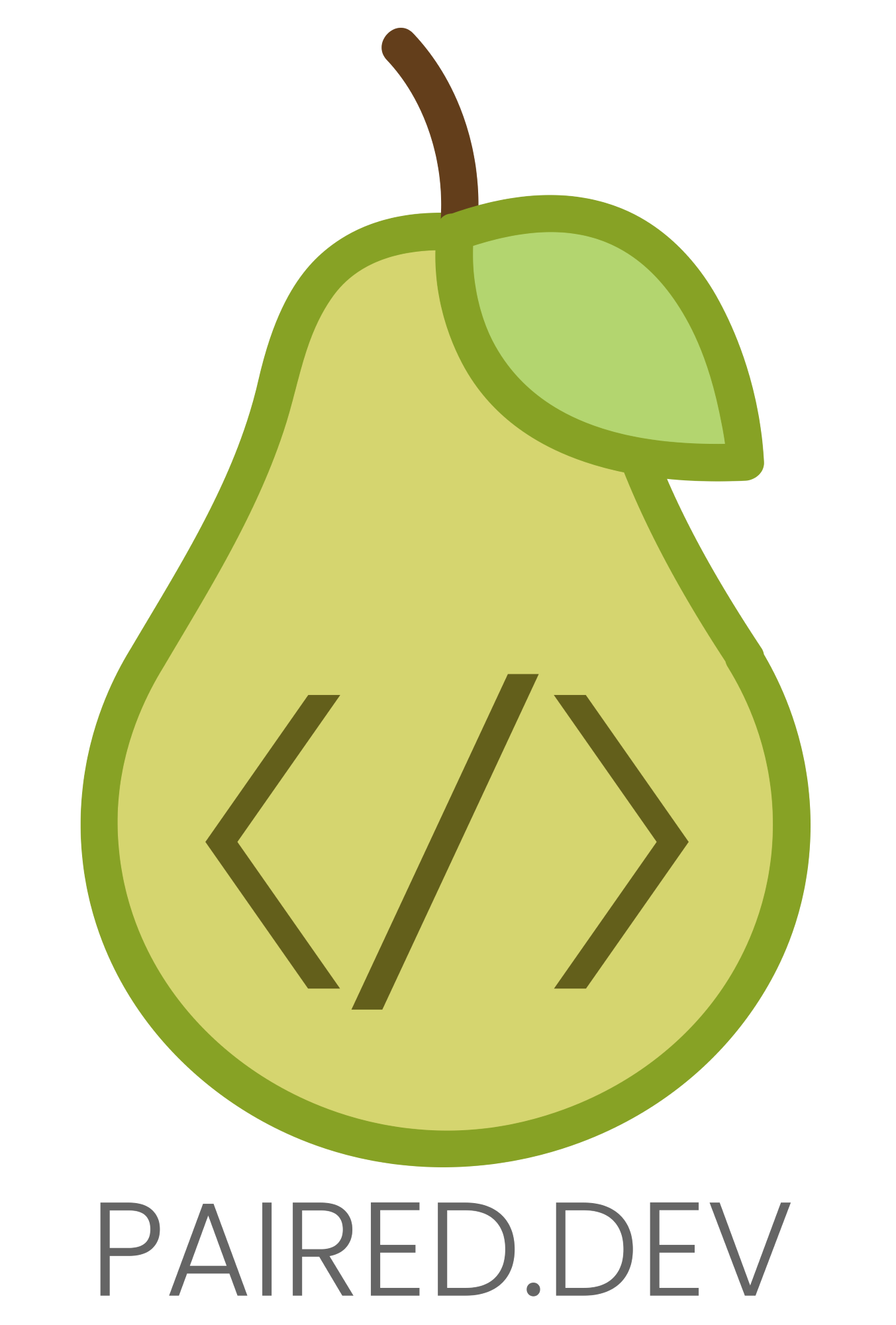
One’s branding, specifically the logo, is often the first impression people have of a brand or company. The logo is going to be used in multiple ways, so it is best to keep the design responsive as to give maximum impact in any use and against any background.
The client, a developer team of two, told me that they paired up to help bring the app ideas to life that others couldn’t. Paired Dev seemed like the logical concept for their new brand identity. It also lent well to the design concept of using a pear shape.
Colors
The colors were all in the name. I chose some common green colors found in a pear that had enough contrast to stand out from one another.
#87a225
#b3d56f
#d5d56f
#656565
#635f1b
Typography
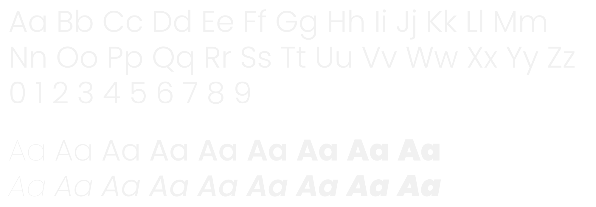
For a team of developers, Poppins was my one and only choice. It has a high readability factor and a wide range of weights to give maximum versatility.
Poppins


