Logo
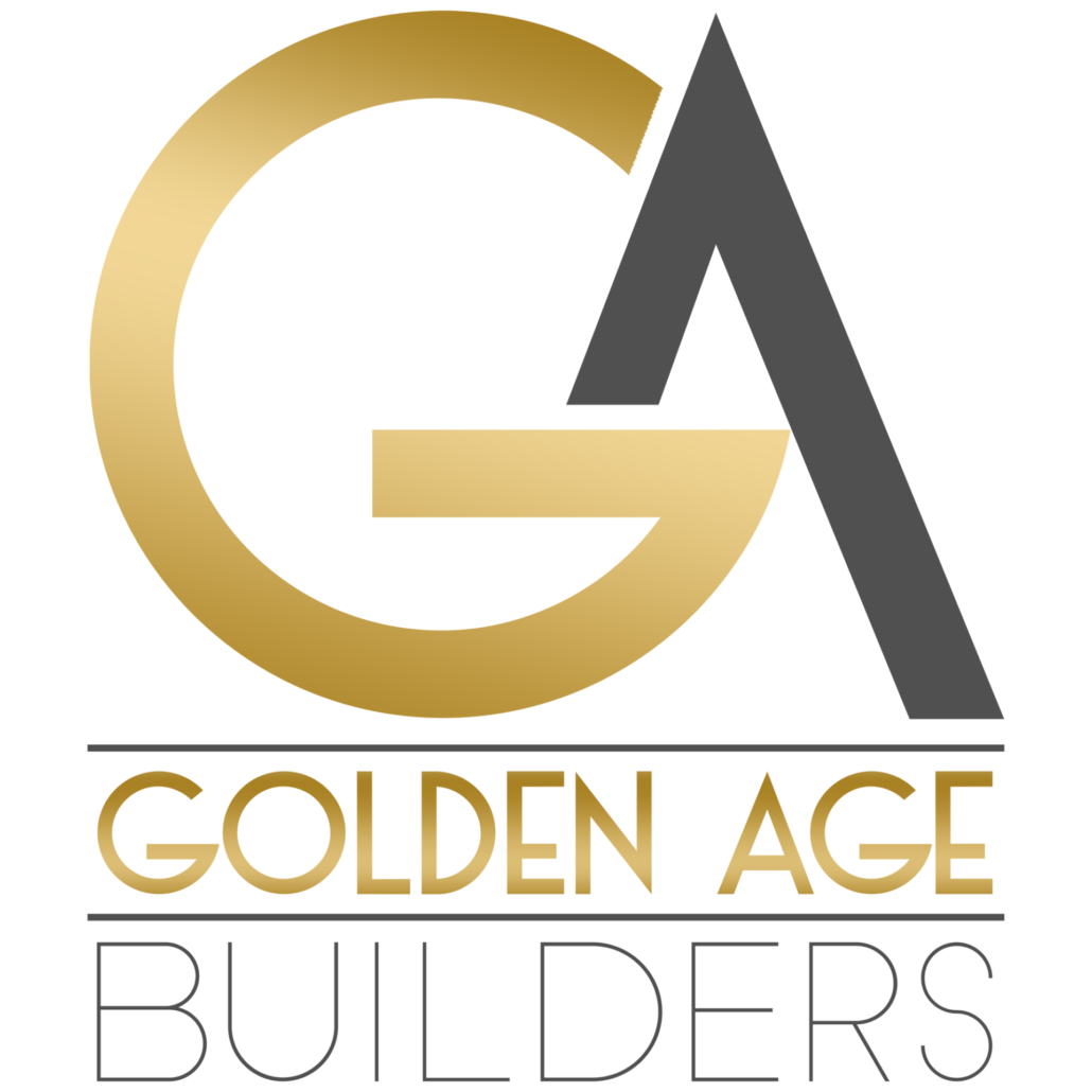
One’s branding, specifically the logo, is often the first impression people have of a brand or company. The logo is going to be used in multiple ways, so it is best to keep the design responsive as to give maximum impact in any use and against any background.
The Golden Age Builders new branding needed to stand out from others in the new home build and remodeling industry. That meant steering away from the typical design scheme of using construction or home symbology and aiming towards clean typography. The term “golden age” invokes a sense of the classic art deco style and that is where I locked in at for the lettering used to build the logo. Using a stylized “G” and “A”, I used the cross bar of the “G” as the cross bar for the “A” to form the symbol form of the new branding. The “G”, which represents the golden in Golden Age Builders, was given a metallic gold color complete with lighting sheen. This color also has the benefit of standing out against a light or dark background.
Colors
The name of the company and overall requested style dictated the colors to be used. Not only do the golden colors invoke a sense of the high-end, but in color psychology it expresses optimism and clarity. Both aspects really worked well with the company’s mission.
#ca9e26
#e9d7a5
#f8f8f8
#dadada
#252525
Typography
The client not only wanted a premium typeface to build their logo, but also one that would work well for full branding and marketing purposes. That meant finding an options that were clean and readable at a glance, but also had that art deco style.
DK Otago
Mont Blanc – Thin


