Logo
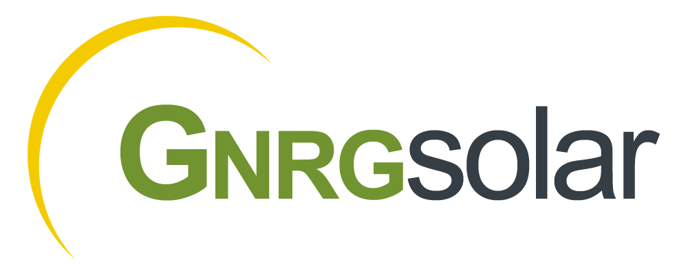
One’s branding, specifically the logo, is often the first impression people have of a brand or company. The logo is going to be used in multiple ways, so it is best to keep the design responsive as to give maximum impact in any use and against any background.
The need was rather straightforward for this project. As a solar panel installation company, the sliver of yellow invokes the sun while the green signifies green energy.
Colors
Red is a bold color that gives a sense of excitement and youthfulness, which is perfect for a company centered on fitness. Finding the right hue was key consideration knowing that the logo in some form will be displayed on either a dark or light background.
#719430
#f4cb00
#f8f8f8
#353d45
#2e3032
Typography
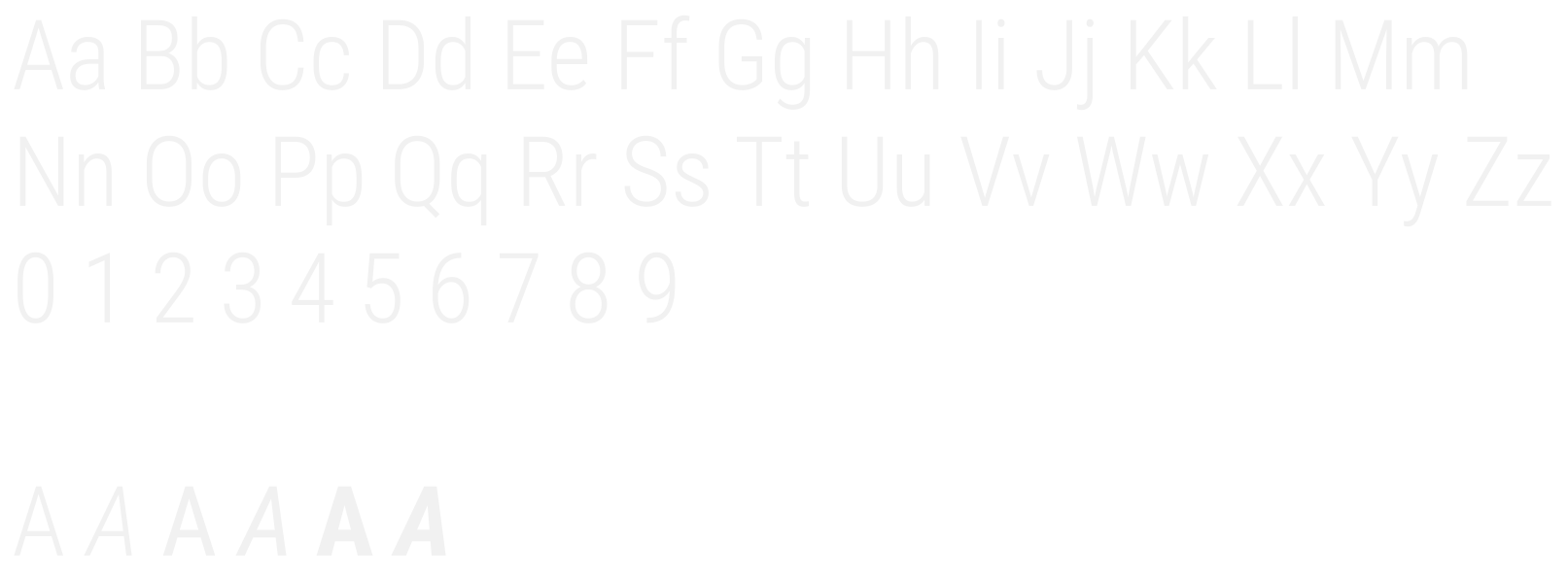
The typeface choice here needed to be just a single option with versatile weights and able to read quickly. Roboto Condensed was the correct choice as it is also a common web font, which allows for its use across more mediums.
Roboto Condensed


