Overview
Project duration: 1 month (Sep 9 – Oct 9, 2023)
Problem
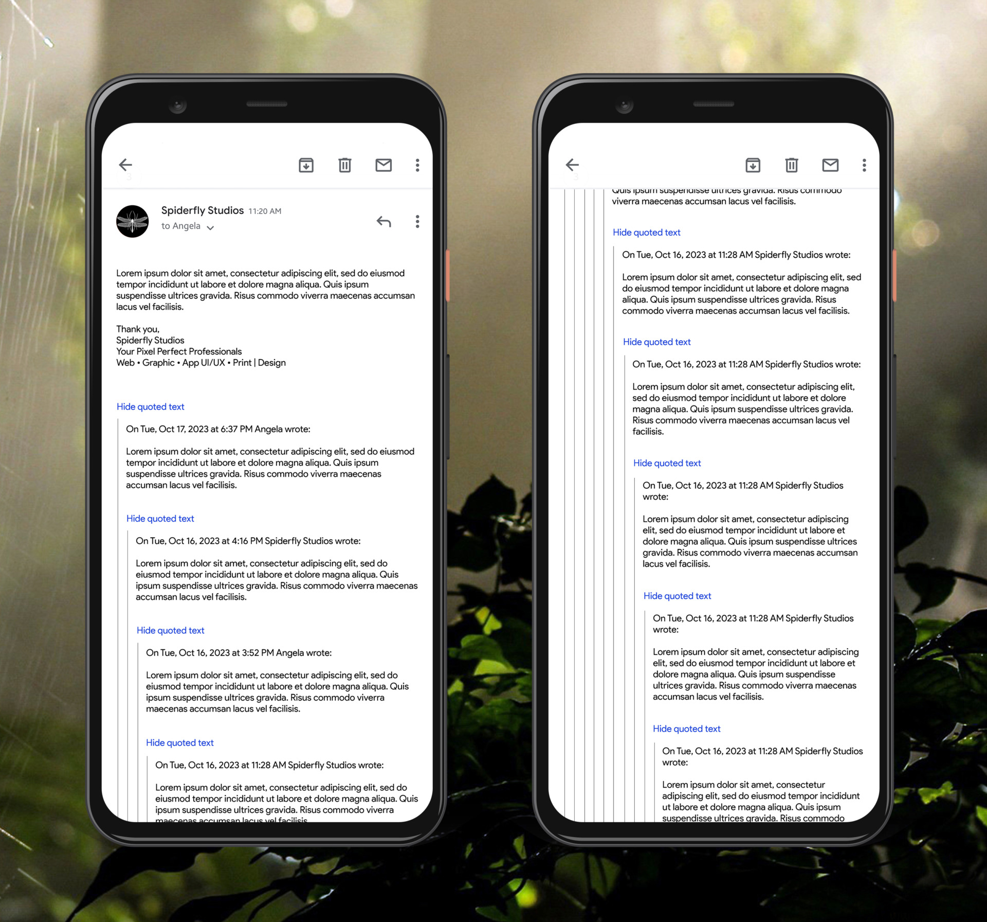
This case study aims to analyze and craft a solution to quoted/nested email content in conversations within the Gmail mobile app. Currently, when one has a long email chain, the quoted content of the prior email is nested and indicated by an indentation using a new margin and a border on the left side. This is a viable UI/UX solution when there are only a few emails in the conversation, but that often isn’t the case of many email exchanges. Over time, these quoted emails become extremely constrained on the horizontal axis making it difficult to read back through the exchange in an effective manner.
Goal
Provide a simple solution to this user experience pain point that has seemingly gone unaddressed.
Research
“Did you find the experience of viewing nested/quoted emails in the Gmail app difficult or easy?”
Pain Point 2
Current Iteration
These screens show how the current system for viewing quoted content works. As one can see, the toggle to view is an easy to miss hyperlink. The more that is quoted in replies, forwards, or manually quoted, the more indented from the left the nested content becomes, thereby constraining the text into a smaller and smaller horizontal space.
Updated Iteration
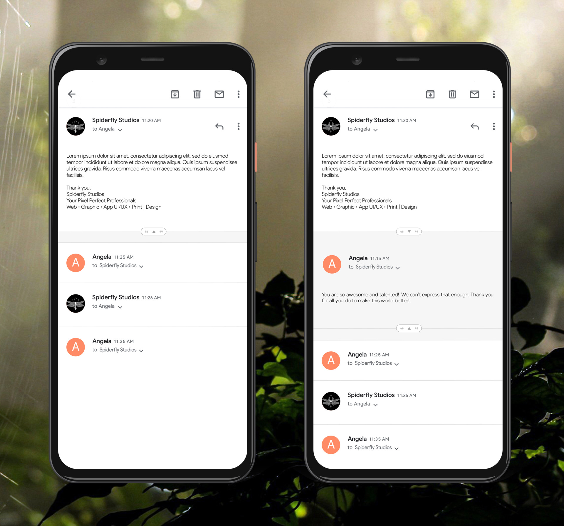
These screens show how a small, yet elegant update to the current user interface (UI) can greatly improve the overall user experience (UX) of the Gmail app, especially for heavy users. All pain points are easily remedied without the need for a custom, hard to implement solution as buttons and expanded content is a standard UI element.
Usability Study Findings
Easier at first
While not as difficult to read through nested, quoted content with smaller email conversations, the greater the historical content, the greater the difficulty it is to read as the content is constrained without an ever shrinking horizontal space.
Old issue
The existing method of reading quoted content has been the user experience since the inception of Gmail and has seemingly gone unaddressed.
Accessibility Considerations
Along with the decreasing width the quoted content is continually constrained to, the current incarnation involves the requirement to find and tap the small hyperlink that states, “view quoted text”. This can easily be missed and difficult to tap. The proposed solution would address this concern by having a toggle button with the space to not only be easily noticed, but easy to activate.
Conclusion
This simple, yet elegant solution would offer an overwhelmingly better user experience for all users, especially those with accessibility concerns. One can take away from this study the realization that sometimes the best solutions don’t need to be overthought or convoluted. There is often a simple answer to a complex problem. In this case, simply adding a button to view quoted content as a toggle, a feature that is already there…it just needed to be refined.


