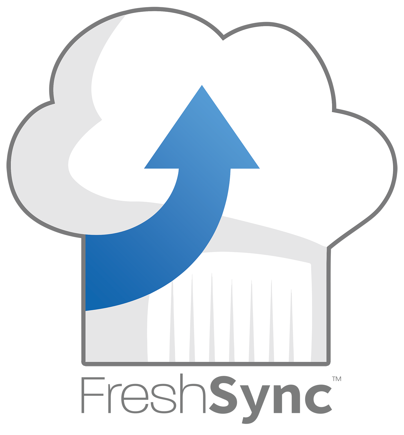
Logo
One’s branding, specifically the logo, is often the first impression people have of a brand or company. The logo is going to be used in multiple ways, so it is best to keep the design responsive as to give maximum impact in any use and against any background. The goal was to hint its relation to the food service industry while invoking a sense of trust through color psychology.
Colors
Blue, a color that invokes trust, was the perfect choice for both aspects of this new service which involves food safety and secure storage of data. Finding the right hue was key consideration knowing that the logo in some form will be displayed on either a dark or light background.
#176db2
#559bd4
#F8F8F8
#e6e6e6
#7b7b7b
Typography
The typeface choice here needed to be just a single option with versatile weights and able to read quickly. Another consideration was to find an option that didn’t deviate too far from a standard sans font that one would see in used in an app or website. Clear sans was the correct choice as it is also a common web font, which allows for its use across more mediums.
Clear Sans


