Logo
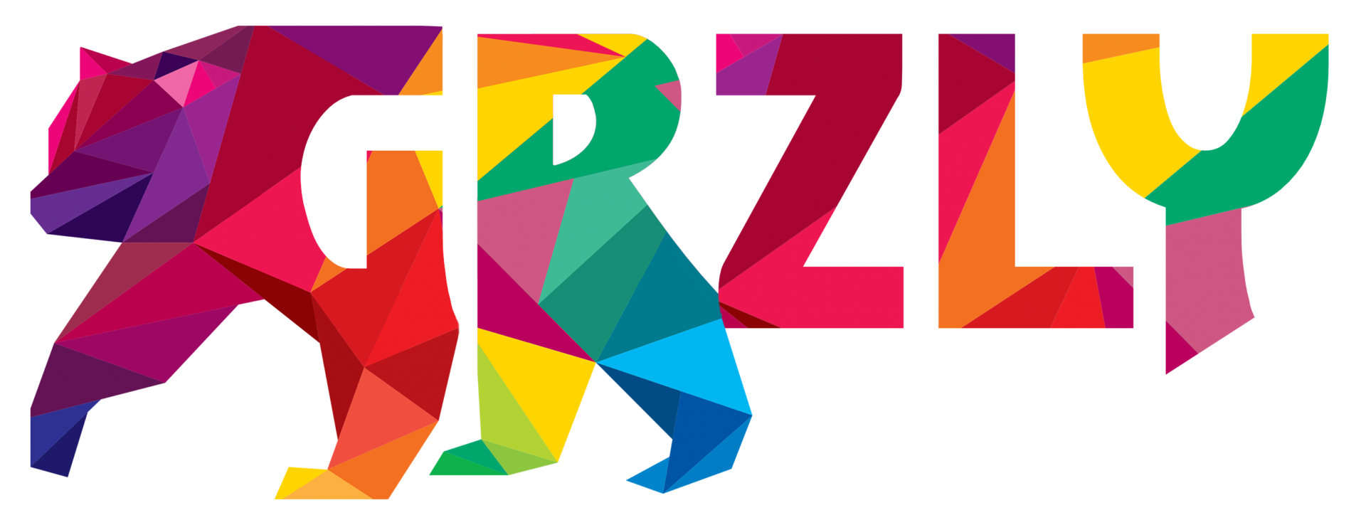
One’s branding, specifically the logo, is often the first impression people have of a brand or company. The logo is going to be used in multiple ways, so it is best to keep the design responsive as to give maximum impact in any use and against any background.
This brand identity project required me to really think outsize the box. Most brand identities make use of just one or two primary colors. This project essentially wanted them all. A fractal concept was the best option to include many colors.
Colors
While this project called for the inclusion of many colors, the core branding colors needed to be able to stand out against most light or dark backgrounds. From each the client could simply alter the hue and saturation to provide contrast.
#00b6f1
#00a76d
#f68b1f
#ba131a
#741472
Typography
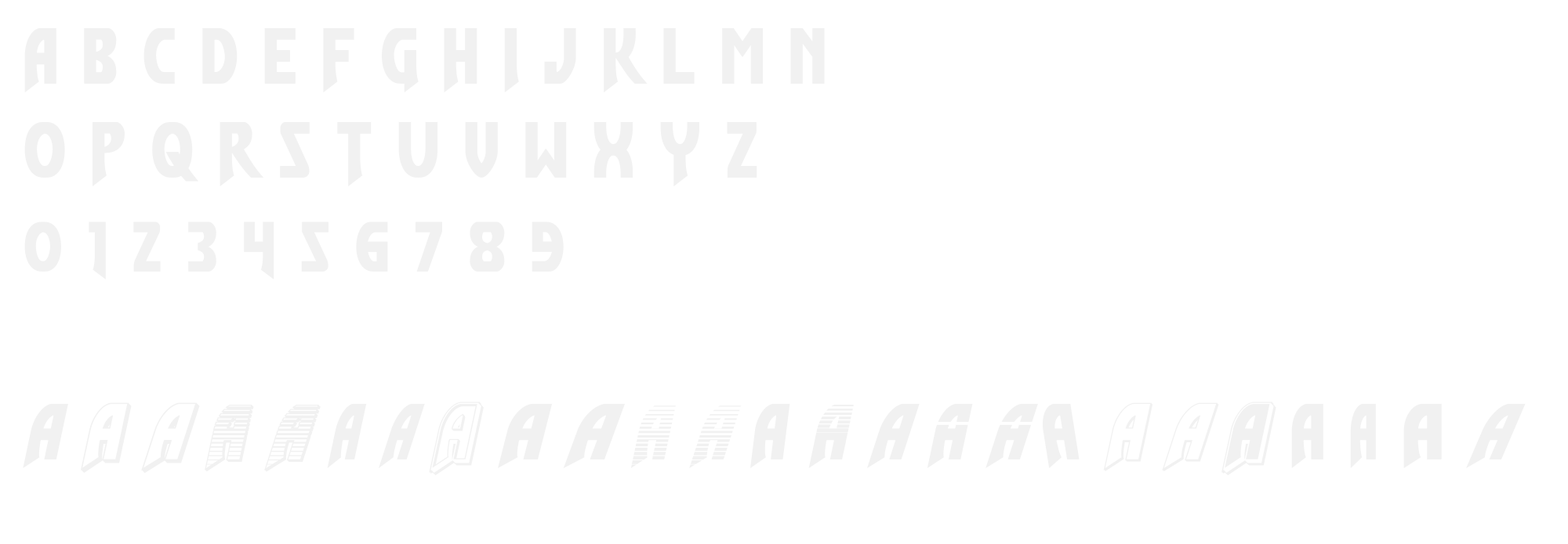
The typeface choice here needed to be just a single option with versatile weights and able to read quickly. It has a classic comic book style to it, which the client really loved on top of the large number of options the font gives.
Flash Rogers


