Overview
Project duration: 1 month (Sep 9 – Oct 9, 2023)
Problem
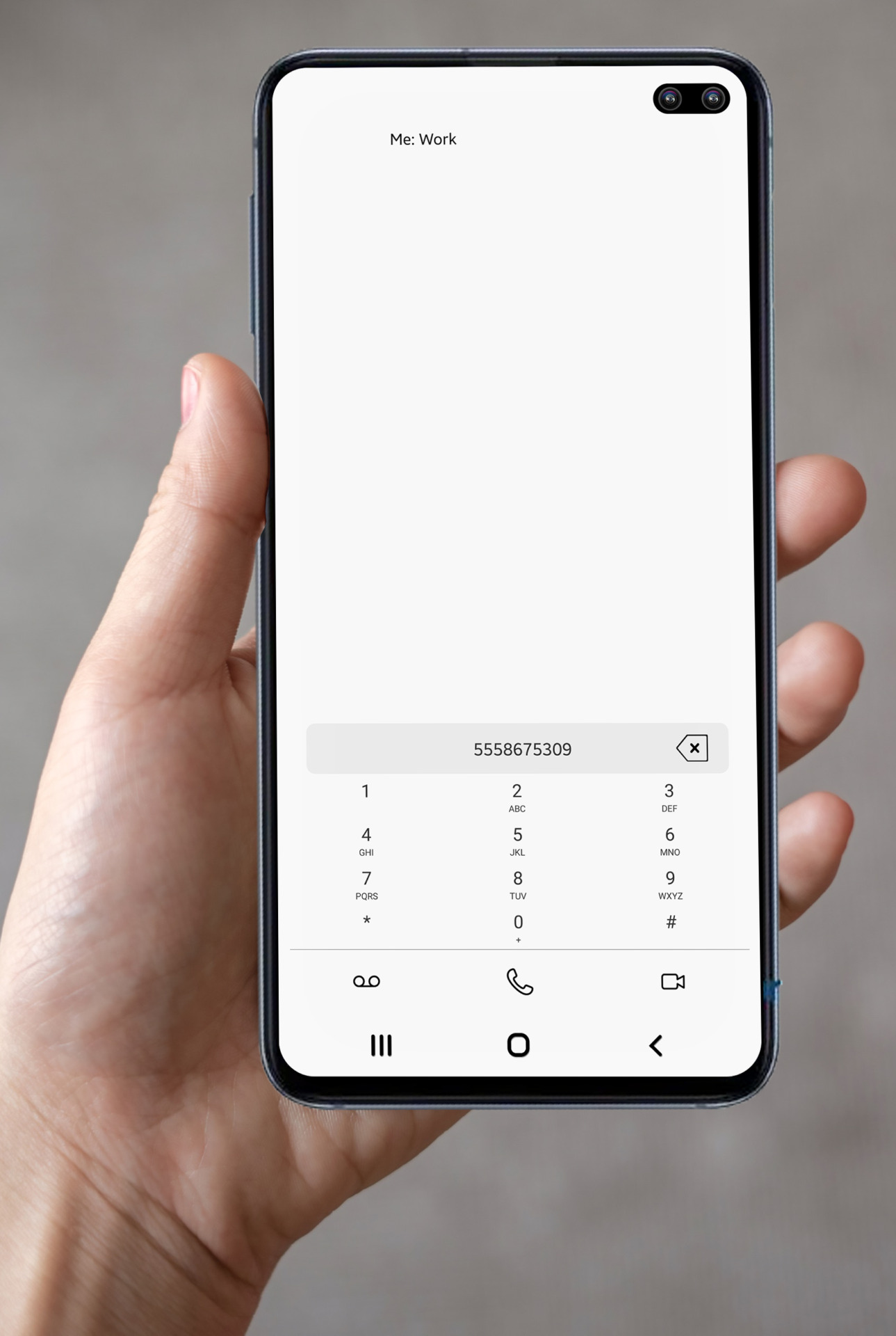
This case study aims to analyze and craft a solution to the poorly designed T-Mobile Digits app. Overall, the app as a whole feels rushed to market. The app UI/UX hasn’t changed since launch and with ever increasing device screen resolutions, the UI elements continue to become compacted. The dialer screen is the most egregious example of this where the numbers are very close together thereby increasing the odds of tapping the incorrect number.
Goal
Provide a simple solution to this user experience pain point that has seemingly gone unaddressed.
Research
The research conducted for this study was rather straightforward and didn’t require the use of any specific demographic beyond being someone who has used the Digits app by T-Mobile. A wide range of users, with a variety of mobile devices were asked a single question:
“How easy is it for you to dial a number with the Digits app?”
Pain Point 2
Current Iteration
These screens show how the current system for viewing quoted content works. As one can see, the toggle to view is an easy to miss hyperlink. The more that is quoted in replies, forwards, or manually quoted, the more indented from the left the nested content becomes, thereby constraining the text into a smaller and smaller horizontal space.
Updated Iteration
These screens show how a small, yet elegant update to the current user interface (UI) can greatly improve the overall user experience (UX) of the Gmail app, especially for heavy users. All pain points are easily remedied without the need for a custom, hard to implement solution as buttons and expanded content is a standard UI element.
Usability Study Findings
Easier at first
The UI elements are so small and close together that it makes it difficult for the average user to effectively dial a number without making a mistake.
Old issue
The UI/UX of this app has not been updated over time to modern standards and compatibility with higher screen density screens.
Accessibility Considerations
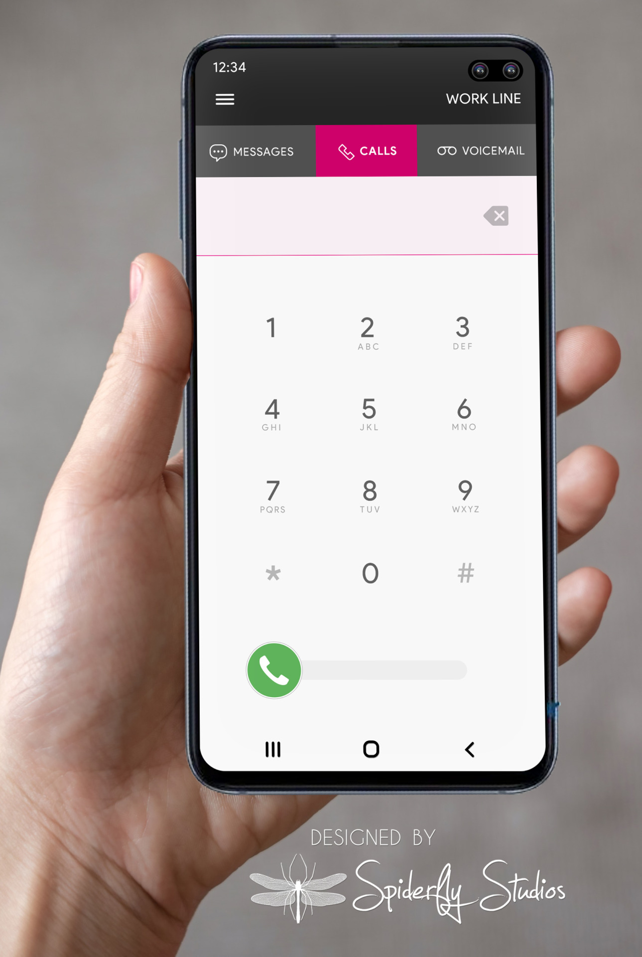
Without updating to modern UI/UX design standards, this app will continue to be difficult for people with poor eyesight, mobility issues, etc to effectively use the app as intended. The same issues affect even those without an accessibility concern.
Conclusion
The DIGITS dialer app is in desperate need of an updates User Interface design, as well as a need to address the User Experience concerts with particular regard to the accessibility concerns. A refreshed UI similar to what is shown here would put the app on the same level as other dialers, which would in turn likely increase usage and retaining a steady user base.


