Logo
One’s branding, specifically the logo, is often the first impression people have of a brand or company. The logo is going to be used in multiple ways, so it is best to keep the design responsive as to give maximum impact in any use and against any background.
This brand identity project required me to think beyond it’s initial need and consider it’s future requirements. As part of a healthcare think-tank project that involved testing the possibilities of how technology like Google Glass would benefit the healthcare industry, there was a need to employ color psychology by using blue as the primary color.
Colors
In color psychology, the color blue invokes a sense of trust, which is exactly what you want in any product or service related to healthcare.
#3A8098
#509AB4
#f1f1f1
#353535
#151515
Typography
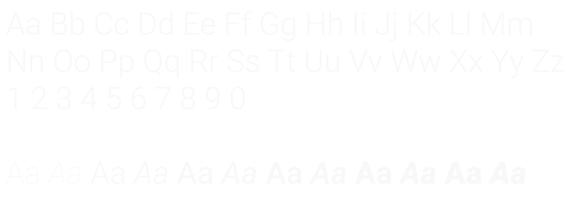
The typeface choice here needed to be just a single option with versatile weights and able to read quickly. Another consideration was to find an option that didn’t deviate too far from a standard sans font that one would see in used in any application. Roboto was the correct choice as it is also a common web font, which allows for its use across more mediums.
Roboto


