Logo
One’s branding, specifically the logo, is often the first impression people have of a brand or company. The logo is going to be used in multiple ways, so it is best to keep the design responsive as to give maximum impact in any use.
This project was a challenging one. As an organization aimed at helping students at a prestigious university, the logo needed a regal look that gave the direct impression its target demographic is law students. The answer was a classic crest using colors that resemble the school’s.
Colors
The colors blue and yellow represent trust and optimism. There couldn’t be a more clear choice for this client, especially since they were similar to the colors of the university.
#313f49
#fbb03b
#f8f8f8
Typography
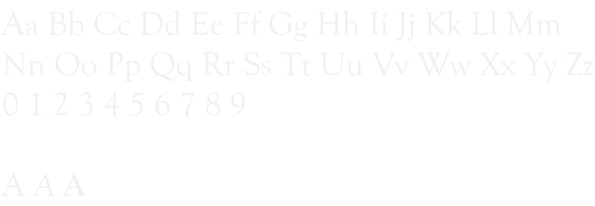
Goudy Old Style was a clear choice for a university law student group. This typeface has the classic, serif look one might associate with a prestigious univeristy.
Goudy Old Style


